Monday 31 March 2014

How did you attract/address your audience?

In our media product, a 2-minute title sequence to our film ‘Post Mortem’, we wanted to appeal to a certain target audience. To do this we had to make sure key features of the horror/thriller genre were met. Our primary audience is men aged 15 – 30 and through research we found that they were the highest proportion of people to consume a film of this type. Our secondary audience is women also of this age bracket, especially age 15 -19. Once knowing the target audience we had to use different things that would keep the interest of your viewers.

When planning the sequence and thinking of those who could star in the film, we looked for what is popular today in TV and film. TV shows such as Doctor Who, Dexter and Sherlock are incredibly popular at the moment especially with the 15 – 19 female age bracket, and having Arthur Darvill – ex Doctor Who star – star in it could attract this audience. Furthermore, we have Matthew McConaughey as our main star to attract the fans of Dallas Buyers Club, Magic Mike and The Wolf Of Wall Street, all of who fit into the remaining target audience bracket.

I asked 15 people on the social networking site Tumblr who had a username that had something to do with Doctor Who whether they would go to see Arthur Darvill in a film. I received 10 responses, 8 said they probably would as they would like to see him act as someone else and the others didn't like him as Rory anyway.

Feedback from our audience has been incredibly positive. Many said they enjoyed it thoroughly and felt the sequence was clever and well made, in intriguing the audience into the rest of 
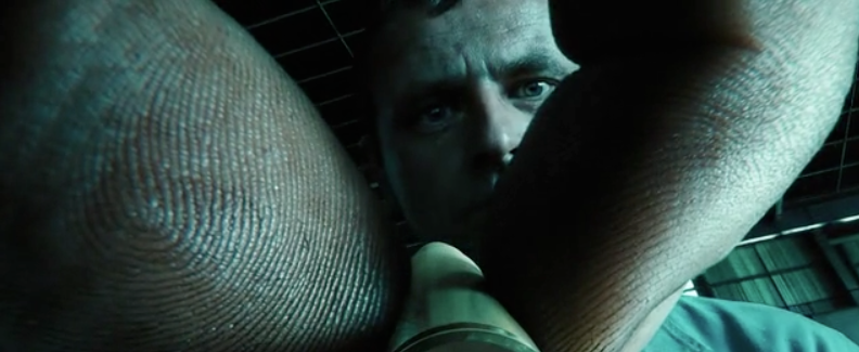
the film. The only negative feedback we received was that it is “possibly too derivative of Se7en”, which is completely understood and we did take a huge amount of inspiration from that title sequence.

Our work could be improved through doing what come up in some of the original planning sessions, which was to have more cuts to key pieces of the film – like the strangling – which would split the sequence up more and forebode what could happen in the film.

Tuesday 25 March 2014

How does your media product represent particular social groups?

On the whole, I feel our title sequence didn’t particularly represent any wide ranging social groups; it focuses on one person, a murderer. In reality killers come few and far between but in film and TV, serial killers and murderers are a common theme and have been for some years, with shows like Midsummer Murders, Dexter and Poirot. We tried to use this current interest in the genre to our advantage.

Those in society that are murderers are often portrayed as psychotic, which generally they are. We had to use this generic representation of killers in our title sequence to make it familiar to viewers. We did this by in editing using the Bad TV effect which made it look like static from a TV. This effect could be said to work in turn to the scattered and chaotic mind of a killer.

Traditionally, film and TV that focuses on a serial killer rarely reveals them early in the film let alone in the title sequence. We didn’t reveal his full identity though, keeping to dark, close up shots of the killer. This cinematography used keeps the secrecy of the killer, to not give anything away from them.

Monday 24 March 2014

In what ways does your media product use, develop or challenge forms and conventions of real media products?


Our group’s title sequence followed the general conventions of a thriller/suspense film – being in a dark and eerie setting, usually a shed/lab or back alley area. We wanted to establish recognisable image that would be familiar with our audience. Through research into the genre we found that many of the title sequences’ story had something to do with the outcome of the film plot.

We looked into a number of title sequences to get a feel for what we wanted ours to look like. Our main inspiration was Se7en. Se7en is a simple title sequence, yet effective in creating anticipation for the film. 

Our film narrative is based on a very clever mass murderer who leaves subtle clues and riddles for the police to pick up on. The film is more focused on the chase from the police rather than the murderer. This is contrary to out title sequence, which focuses on the killers lair, where he plans and looks back on previous killings. We did this in the title sequence as it saves time in the film, as the a little background on the killer has been shown.

Many of our camera shots were very close up, burring out the surroundings or only having a key light focusing on one area that blacked out the background, which puts focus on the object in frame. We used the occasional canted angle to just vary the shots that we used, as most of the movement was added in editing. We didn’t have any panning or moving shots because of how close up and detailed the still shots were. In editing we used the Bad TV effect to create movement, rather than just having still images.


The background sound we used was in the genre of ‘industrial’ or ‘industrial metal’, which is a heavy and intense sound. We used this as it build up suspense and horror in the title sequence. The as the music moved on, it gradually got heavier and more haunting until the light went out and the music dulled down again.

The mise-en-scene of the title sequence was very dark, small and cramped. It was based in a shed therefore we needed to convey the size. We used many close up shots; this meant the viewer feels closer to the killer and what is happening as they can see every little detail of his workbench and his hands in some shots. As there are no panning shots the audience can only see from what’s burred out behind the main object, this could be said to create suspense.


Our typography is a scratchy front, which looks like someone has written the words and then back gone over them a few times. This could be said to be the killer’s handwriting, as it looks very erratic. Furthermore, it fits very stereotypically into the suspense/thriller genre.


Finally, our title sequence doesn’t necessarily challenge the conventions of traditional media in this genre, rather fits perfectly into it. We wanted it to be clear as to what the film would be about and we feel we have achieved that.

Friday 21 March 2014

Title Sequence Feedback

On Wednesday we previewed our title sequence to the class. These are the feedback sheets.


The main feedback was that some of the shots were too long and that it was closely related the the Se7en title sequence. Liam has since re-edited the sequence and cut down shots.


Monday 17 March 2014

What kind of media institutions might distribute a thriller film?

In the UK, our thriller/suspense could be distributed by such companies as Metrodome. There is a scheme called the microwave scheme which gives small British film companies the chance to make their movie with a £100,000 budget and 18 days to do it.


With the recent success of online campaigns like Batman: The Dark Knight Rises and independent movie Camp Takota, it is proven that the internet is the rising cheap and effective way of distributing a film.


As our film is aimed at those of the ages 15-30, viral marketing would be an easier way of getting our film known rather than going by traditional media and blowing half our money on the public marketing. Via the means of social media we can contact those who may directly fit our primary or secondary audiences - such as fans of Se7en, Sherlock, Dexter, Batman, Supernatural, Breaking Bad and many more to try and have them help promote our film. 
We could contact these people by looking for fan pages on sites such as Twitter, Facebook and Tumblr and asking if they will spread the message to followers of the fan page. Leaving a link to the trailer and some information about the film and see where all goes from there would be an effective and cheap way of promoting Post-Mortem.

For examples of a thriller, Shifty is a good example as it is a small scale British film which used viral marketing as a means of getting their film heard about.


Who Would Be The Audience For 'Post-Mortem'?

Who Would Be The Audience For 'Post-Mortem'?


Our target audience is mainly men aged 15 - 30 as they are the most common group to view a film that is in our genre. The target audience is primarily to be white, working/middle class (working class but with money to spare for leisure) and have a job in the skilled manual work sector. He is not married, possibly with a child and in a relationship. Our male audience members (over the age of 18) would also be inclined to go to the pub after work and do more manly things with their day, so I movie of this genre tends to be of choice when visiting the cinema.

Our secondary audience is very similar to the primary audience only female. They will be of the same age range and class with the same marital status. This tends to be because the man and woman would go together to the movie. On the other hand, more women are going to see films in the thriller genre as a change from their stereotypical romantic comedy.

We researched this by looking at the average audiences of this film genre thus being able to create a target audience for Post-Mortem.


Evaluation of 'Post-Mortem' Title Sequence.

Our group was working towards a Se7en inspired title sequence - with a dark and eerie mise-en-scene. We wanted the title sequence to create suspense for the audience, with positive anticipation of what the film would be.

Our title sequence is a series of fast paced, mainly close up shots, of the various workings of our killer's 'mind palace'. We have a book with drawings and pieces of writing in that the murderer wrote which is the main centre piece of the sequence. The sequence is based on  a tour of the killer's work bench and area around him. It also shows the murderer looking at past work and writing about current and/or future work.

Day 2 Re-shoot.

On Sunday (16.3.14) our group did our final pick up shots for our title sequence. It began with just Liam and I trying to do lighting and filming and be the actor in front of the camera which was a challenge. Then Sam turned up and we finished our final pick up shots for the title sequence.


We did many of the ok shots that were already edited into the sequence again because we felt they could be created better with a camera where the depth of field could be controlled. We also we shot the final frames (image 2 and 3) because the camera was a bit shaky on the first version.


Friday 14 March 2014

Day 1 Re-shoot and Camera Change.

For the first day of re-shooting our title sequence, we changed cameras from what we had initially used: 

Which is the camera I own and what we felt would be fine for shooting. We soon realised that using a camera with 1) autofocus and 2) uses AA batteries that are not a re-chargeable was a poor decision on our part. 14 batteries later we finished shooting to find out when we watched the footage back it was too dark and we had to re-shoot. This time we used the DSLR and with focus that we could control and a battery that lasted far longer. 

The focus that could be altered by us meant that we could get far better shots and we didn't have to guess (when we couldn't see the camera screen) whether the shot was in focus. 


This is one of our favourite shots of the title sequence that was made using the DSLR. The old camera wouldn't have got the focus in the correct place or would have had the whole shot in focus.


We still need to re-shoot on Sunday (16.3.14) to get the final shots and then that is all filming done, Liam can finish editing ready to show on Wednesday.


Music for the Title Sequence

This is the main track we have used for our title sequence:

https://soundcloud.com/industrial-records/sets/throbbing-gristle-tracks

We used this because it sounds similar to the Se7en sequence which we have taken much of our inspiration from for our title sequence.

Tuesday 4 March 2014

First Draft Credits

This is the first draft to our credits and the production company logo we created.


The ones with a black font are those which have a light background when put into the title sequence and those with white writing have a dark background. 


Audience Involvement: Font

For the choice of font we asked various people who fit the target audience. These were the choices:


1) 

2) 

3)

4)
5)


The resounding answer was number 1 because it has a scratchy effect closest to what we wanted and people felt it best fit with the title sequence.


Monday 3 March 2014

Editing

Editing began this week and Liam has taken charge of that. He has split the screen and used an effect called Bad TV which makes the shot shaky and like static on the TV.


This is done on many of the shots to add pace and an eerieness to the sequence.

Filming Of The Title Sequence

This week we filmed our title sequence. Filming took two days overall, with around 35 minutes of footage been shot. The main issue we had was using a poor camera with auto focus and which relied on AA batteries to work.

Our first day of filming went well, getting all of the shots we intended to get, but on the second day the lighting we used had broke, so it went from a yellowish light to having to use a bright white light, meaning we had to re-shoot 12 shots.

Also on Friday (23.2.14) Liam began to put together some of the shots that worked and had the correct lighting in Final Cut Pro. He put in our sound track that will be an underscore, this is where the music will be conjoined and overlaid with other sounds and scores. 

We also need to re-shoot with a better camera because some of the shots are too darka dn didn't look how we had initially intended.

Typography

Forrest Gump

Forrest Gump uses a serrif font placed in the centre of the screen with traditional/classic music in the background.
It is very slow paced, steady and smooth with no editing or fast past paced camera work used.
 The font fades in and out of the sequence which gives a further sense of calm to the sequence.

Lord Of War

Lord Of War uses laid back music against a serious issue.

It follows the production of a bullet from the conveyer belt to its transportation to it being shot.

A small and subtle font is used, not getting in the way from the focus on the bullet.
The title sequence is a point of view shot from the end of the bullet, this follows the whole way through the title sequence.


 The final frames are of the bullet being loaded into the gun, and being fired to shoot what comes across as an innocent civilian, then the sequence ends and the film begins.


Catch Me If You Can

Catch Me If You Can has a smooth and flowing font, giving off a constant sense of movement which then gives an idea as to the plot of the film. 
Two different fonts are used which slightly foreshadows the use of two different identities for the main character. 
The font is incorporated into the animation of the title sequence, with a heavy Saul Bass influence too it.


The fonts used are sans serrif and serrif, so one is more formal like a typewriter looking like THIS and the other is more informal and rounded, looking like THIS.