Friday, 14 March 2014

Day 1 Re-shoot and Camera Change.

For the first day of re-shooting our title sequence, we changed cameras from what we had initially used: 

Which is the camera I own and what we felt would be fine for shooting. We soon realised that using a camera with 1) autofocus and 2) uses AA batteries that are not a re-chargeable was a poor decision on our part. 14 batteries later we finished shooting to find out when we watched the footage back it was too dark and we had to re-shoot. This time we used the DSLR and with focus that we could control and a battery that lasted far longer. 

The focus that could be altered by us meant that we could get far better shots and we didn't have to guess (when we couldn't see the camera screen) whether the shot was in focus. 


This is one of our favourite shots of the title sequence that was made using the DSLR. The old camera wouldn't have got the focus in the correct place or would have had the whole shot in focus.


We still need to re-shoot on Sunday (16.3.14) to get the final shots and then that is all filming done, Liam can finish editing ready to show on Wednesday.


Music for the Title Sequence

This is the main track we have used for our title sequence:

https://soundcloud.com/industrial-records/sets/throbbing-gristle-tracks

We used this because it sounds similar to the Se7en sequence which we have taken much of our inspiration from for our title sequence.

Tuesday, 4 March 2014

First Draft Credits

This is the first draft to our credits and the production company logo we created.


The ones with a black font are those which have a light background when put into the title sequence and those with white writing have a dark background. 


Audience Involvement: Font

For the choice of font we asked various people who fit the target audience. These were the choices:


1) 

2) 

3)

4)
5)


The resounding answer was number 1 because it has a scratchy effect closest to what we wanted and people felt it best fit with the title sequence.


Monday, 3 March 2014

Editing

Editing began this week and Liam has taken charge of that. He has split the screen and used an effect called Bad TV which makes the shot shaky and like static on the TV.


This is done on many of the shots to add pace and an eerieness to the sequence.

Filming Of The Title Sequence

This week we filmed our title sequence. Filming took two days overall, with around 35 minutes of footage been shot. The main issue we had was using a poor camera with auto focus and which relied on AA batteries to work.

Our first day of filming went well, getting all of the shots we intended to get, but on the second day the lighting we used had broke, so it went from a yellowish light to having to use a bright white light, meaning we had to re-shoot 12 shots.

Also on Friday (23.2.14) Liam began to put together some of the shots that worked and had the correct lighting in Final Cut Pro. He put in our sound track that will be an underscore, this is where the music will be conjoined and overlaid with other sounds and scores. 

We also need to re-shoot with a better camera because some of the shots are too darka dn didn't look how we had initially intended.

Typography

Forrest Gump

Forrest Gump uses a serrif font placed in the centre of the screen with traditional/classic music in the background.
It is very slow paced, steady and smooth with no editing or fast past paced camera work used.
 The font fades in and out of the sequence which gives a further sense of calm to the sequence.

Lord Of War

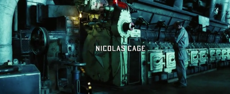
Lord Of War uses laid back music against a serious issue.

It follows the production of a bullet from the conveyer belt to its transportation to it being shot.

A small and subtle font is used, not getting in the way from the focus on the bullet.
The title sequence is a point of view shot from the end of the bullet, this follows the whole way through the title sequence.


 The final frames are of the bullet being loaded into the gun, and being fired to shoot what comes across as an innocent civilian, then the sequence ends and the film begins.


Catch Me If You Can

Catch Me If You Can has a smooth and flowing font, giving off a constant sense of movement which then gives an idea as to the plot of the film. 
Two different fonts are used which slightly foreshadows the use of two different identities for the main character. 
The font is incorporated into the animation of the title sequence, with a heavy Saul Bass influence too it.


The fonts used are sans serrif and serrif, so one is more formal like a typewriter looking like THIS and the other is more informal and rounded, looking like THIS.