Showing posts with label title sequence. Show all posts
Showing posts with label title sequence. Show all posts
Friday, 18 April 2014

Monday, 24 March 2014
In what ways does your media product use, develop or challenge forms and conventions of real media products?
Our group’s title sequence
followed the general conventions of a thriller/suspense film – being in a dark
and eerie setting, usually a shed/lab or back alley area. We wanted to
establish recognisable image that would be familiar with our audience. Through
research into the genre we found that many of the title sequences’ story had
something to do with the outcome of the film plot.
We looked into a number of title
sequences to get a feel for what we wanted ours to look like. Our main
inspiration was Se7en. Se7en is a simple title sequence, yet effective in
creating anticipation for the film.
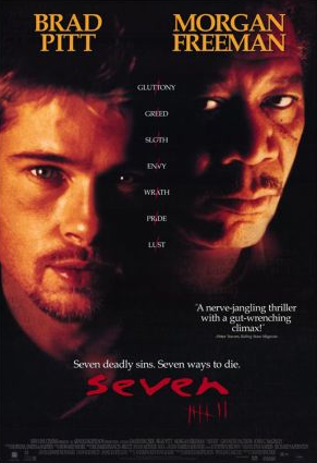 Our film narrative is based on a very
clever mass murderer who leaves subtle clues and riddles for the police to pick
up on. The film is more focused on the chase from the police rather than the
murderer. This is contrary to out title sequence, which focuses on the killers
lair, where he plans and looks back on previous killings. We did this in the
title sequence as it saves time in the film, as the a little background on the
killer has been shown.
Many of our camera shots were
very close up, burring out the surroundings or only having a key light focusing
on one area that blacked out the background, which puts focus on the object in
frame. We used the occasional canted angle to just vary the shots that we used,
as most of the movement was added in editing. We didn’t have any panning or
moving shots because of how close up and detailed the still shots were. In
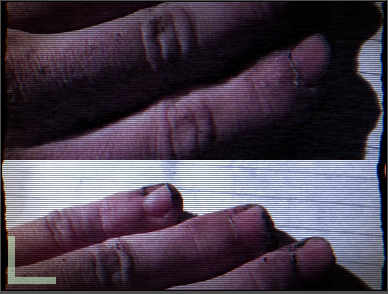
editing we used the Bad TV effect to create movement, rather than just having
still images.

The background sound we used was
in the genre of ‘industrial’ or ‘industrial metal’, which is a heavy and
intense sound. We used this as it build up suspense and horror in the title
sequence. The as the music moved on, it gradually got heavier and more haunting
until the light went out and the music dulled down again.
The mise-en-scene of the title
sequence was very dark, small and cramped. It was based in a shed therefore we
needed to convey the size. We used many close up shots; this meant the viewer
feels closer to the killer and what is happening as they can see every little
detail of his workbench and his hands in some shots. As there are no panning
shots the audience can only see from what’s burred out behind the main object,
this could be said to create suspense.


Our typography is a scratchy
front, which looks like someone has written the words and then back gone over
them a few times. This could be said to be the killer’s handwriting, as it
looks very erratic. Furthermore, it fits very stereotypically into the
suspense/thriller genre.

Finally, our title sequence
doesn’t necessarily challenge the conventions of traditional media in this genre, rather
fits perfectly into it. We wanted it to be clear as to what the film would be
about and we feel we have achieved that.
Friday, 21 March 2014
Title Sequence Feedback
On Wednesday we previewed our title sequence to the class. These are the feedback sheets.


The main feedback was that some of the shots were too long and that it was closely related the the Se7en title sequence. Liam has since re-edited the sequence and cut down shots.
Monday, 17 March 2014
Evaluation of 'Post-Mortem' Title Sequence.
Our group was working towards a Se7en inspired title sequence - with a dark and eerie mise-en-scene. We wanted the title sequence to create suspense for the audience, with positive anticipation of what the film would be.
Our title sequence is a series of fast paced, mainly close up shots, of the various workings of our killer's 'mind palace'. We have a book with drawings and pieces of writing in that the murderer wrote which is the main centre piece of the sequence. The sequence is based on a tour of the killer's work bench and area around him. It also shows the murderer looking at past work and writing about current and/or future work.
Our title sequence is a series of fast paced, mainly close up shots, of the various workings of our killer's 'mind palace'. We have a book with drawings and pieces of writing in that the murderer wrote which is the main centre piece of the sequence. The sequence is based on a tour of the killer's work bench and area around him. It also shows the murderer looking at past work and writing about current and/or future work.
Monday, 3 March 2014
Filming Of The Title Sequence
This week we filmed our title sequence. Filming took two days overall, with around 35 minutes of footage been shot. The main issue we had was using a poor camera with auto focus and which relied on AA batteries to work.
Our first day of filming went well, getting all of the shots we intended to get, but on the second day the lighting we used had broke, so it went from a yellowish light to having to use a bright white light, meaning we had to re-shoot 12 shots.
Also on Friday (23.2.14) Liam began to put together some of the shots that worked and had the correct lighting in Final Cut Pro. He put in our sound track that will be an underscore, this is where the music will be conjoined and overlaid with other sounds and scores.
We also need to re-shoot with a better camera because some of the shots are too darka dn didn't look how we had initially intended.
Typography
Forrest Gump


Lord Of War
Lord Of War uses laid back music against a serious issue.
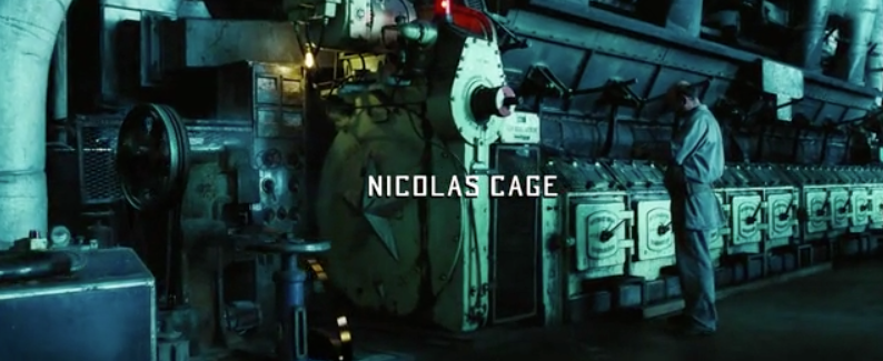

 A small and subtle font is used, not getting in the way from the focus on the bullet.


Catch Me If You Can

Two different fonts are used which slightly foreshadows the use of two different identities for the main character.


The fonts used are sans serrif and serrif, so one is more formal like a typewriter looking like THIS and the other is more informal and rounded, looking like THIS.
Tuesday, 11 February 2014
Developing the Detective
In order to create a convincing and detailed title sequence we'll have to research and find people or characters from film and TV that we can use to help develop the character of Detective Lawrence Ansen and our murderer.
Over the years, TV, books and film have seen a range of detective characters as murder mystery is a very popular viewer experience. Memorable characters such as Sherlock, Dexter, Miss Marple, Hercule Poirot and so on have adapted from books with great description of the characters background, personalities, looks etc and it is difficult to create a memorable Murder Mystery detective or catalyst to the situation without coming from a book. For our characters, this means we can take characteristics of various memorable characters and put them into one for our own detectives and killers.
In the film, Se7en, the film that inspired us to take our title sequence down this route, has two very memorable detectives; Detective Mills, who is played by Brad Pitt and Detective Somerset who is played by Morgan Freeman. It is the character of Mills that I find to mostly fit best with the character we wish to create as he is a detective who needs to prove himself in a big murder case and he is passionate about this case and it takes him over the edge.
The fact that Mills has a wife and love-life helps the viewer feel sympathetic and connect to the character and his situation. This is what we will aim to portray to the audience in our title sequence; being done through images of his wife and other varying forms of media.
Friday, 7 February 2014
Se7en Title Sequence Analysis.

Narrative
The villain seems to be more evil and brutal when there is that aspect of mystery as the tension is building within the audience.
The different words focus on the films complex plotline, suggesting that the audience has to think hard about the different events within the film.
Mise-en-scene
The opening sequence does not include any long shots of the setting; but the audience can assume that the things taking place are happening in someone’s home, or in a lab as the props are what you would typically find in these places. However not actually knowing the location could create tension for the audience.

The props used in the opening could be associated with investigations and detective work. These include books, photos, files, pens and paper. It appears as if the person is putting pictures and information into one file or case.


All of the objects are shown very close up and therefore they take up most of the frame. This creates suspense as the audience don't know who the person doing these things is as they cannot see their face or where they are.
All of the shots are reasonably dark, this connotes danger and that the film will be quite serious. The shots are indoors using low key lighting, this gives the setting a dull and suspicious feel.
Most of the colours shown are black and white, however when the photos are shown being developed you see the red light that is used to develop them. There is also a flash of red across the screen at one point giving the connotations of blood and murder.

Editing
The opening is in a montage format, it is lots of different clips put together. The fact that it isn’t done in an chronological order that makes sense gives the idea that this person is doing many different things to create some sort of file or investigation about something.
The fading of some of the transitions creates an eerie feel, and the fade to black reflects the sincerity and darkness of the overall film.
The filter in the camera is sepia which is made up of grimy and dirty browns, this makes the audience feel nauseous and uneasy, highlighting the psychological thriller genre.
Most of the shots are fairly short, however some are edited into slow motion. The music is also quite slow, particularly at the beginning which gives it a slow pace. As the sequence builds up and gets faster towards the end, it creates tension for the audience and shows that it will be a tense film to watch.

Cinematography
As all of the shots are close up objects, there are many shallow focuses. For example of the books, a pen, photos etc. These allow the audience to focus on what is happening with these items as it may reflect the happenings in the film. It also distracts them from seeing who the person is that is doing these things which creates tension.


During the opening sequence, most of the camera shots are still. There is not much panning or any other kind of movement as all of the shots focus on one main thing and keep it at the centre of the shot.
Titles
The titles that are written appear in a font that resembles handwriting. This fits in with the idea of someone creating a file or investigation, as well as some of the props. The text appears in white which makes it stand out against the dark background.


Tuesday, 28 January 2014
Second Title Sequence idea.
Today the idea for our title sequence got changed from the horror house idea to a serial killer and a police officer.
The main idea for the film is a policeman trying to catch a serial killer. The story is focused more on the policeman than the killer. The policeman's job is on the line because he has a reputation for not being all too good at his job, so he takes on the case of a notorious killer who not even the top detectives at Scotland Yard can catch.
The killer is aware of who is trying to catch him so leaves little clues or notes such as 'the longer it takes the more die' which torments the policeman as he can't catch him but knows he should be able to.
The title sequence will be of the killer in his shed flicking through drawing of how he murders his victims, with split second shots of it happening in real life.
Sunday, 19 January 2014
Title Sequence Sounds
In this lesson we looked at the following title sequences:
Se7en (1995) — Art of the Title
Vertigo (1958) — Art of the Title
Catch Me If You Can (2002) — Art of the Title
Skyfall (2012) — Art of the Title
We spoke about different title sequences like Se7en, Skyfall, Vertigo and Catch Me If You Can, looking specifically for the type of things that were used to make the sound.
We discussed different sounds we heard such as musical sounds (drums, symbols), or sounds that would have been created by someone - foley. EG footsteps, wind, door slamming and crashing.
We then spoke about foley sounds and how they're created, and went off to record our own using a device like this:

It picks up the tiniest of sound from each end when can then be used as it is or distorted to create a different sound.
My group used the school lockers to smash shut, the radiator and a creaky door.
Se7en (1995) — Art of the Title
Vertigo (1958) — Art of the Title
Catch Me If You Can (2002) — Art of the Title
Skyfall (2012) — Art of the Title
We spoke about different title sequences like Se7en, Skyfall, Vertigo and Catch Me If You Can, looking specifically for the type of things that were used to make the sound.
We discussed different sounds we heard such as musical sounds (drums, symbols), or sounds that would have been created by someone - foley. EG footsteps, wind, door slamming and crashing.
We then spoke about foley sounds and how they're created, and went off to record our own using a device like this:
It picks up the tiniest of sound from each end when can then be used as it is or distorted to create a different sound.
My group used the school lockers to smash shut, the radiator and a creaky door.
Title Sequence Designers
Today (10.1.14) we watched various title sequences from different graphic designers with different styles, such as:
Dexter: http://www.artofthetitle.com/title/dexter/
Se7en: http://www.artofthetitle.com/title/se7en/
The Man With The Golden Arm: http://www.artofthetitle.com/title/the-man-with-the-golden-arm/
Napoleon Dynamite: http://www.artofthetitle.com/title/napoleon-dynamite/
Each of these have a distinct way of creating a title sequence which reflects the genre of the film and what it will be about.Dexter is about a killer who only kills people who have done bad to other people. The title sequence is of a low pace, with calm back ground music but it feels like the pace could pick up and any given moment. This is similar to the character of Dexter, who is calm throughout the original book but towards the end really picks up the pace of his work, but murdering or helping to murder one of his colleagues.
We then looked at how a title sequence is planned; the time frames between what is shown, the order of the names eg; Producers, Directors, Starring Actors, Make Up Artists etc. We then went and looked at a title sequence of our choice, seeing the pattern between the times of which something was shown, the order of the names etc. We found that it is often the same throughout every sequence, usually having the most important people first and down to the least important.
First Title Sequence Idea
Today (7.1.14) we gathered an idea for our title sequence.
Our current idea is a horror/thriller/suspense movie. It is about a man who goes into a middle/upper class home with the intention to kill. The owners of the house are away on holiday to the child who lives there has a big sleepover/party, the stereotypical horror movie. The killer would let himself into the house and just walk around initially, gathering in his surroundings. A character trait of the killer we suggested is that he would never run, he would always walk to his next victim, no matter how fast the person he was trying to get was escaping. They are in a house, he will get them eventually. The movie would progress and he would kill people off one by one until it is just the homeowners daughter left. She doesn't get killed, instead she and the parents are in on it, and they all walk over to the neighbours house, leaving the movie open to a sequel.
For the second hour of the lesson we made a Powerpoint explaining what the film would be about, hypothetically who would be in it, how much it would cost, how much it would make etc to be presented the following day to the class.
Subscribe to:
Posts (Atom)