Our group’s title sequence
followed the general conventions of a thriller/suspense film – being in a dark
and eerie setting, usually a shed/lab or back alley area. We wanted to
establish recognisable image that would be familiar with our audience. Through
research into the genre we found that many of the title sequences’ story had
something to do with the outcome of the film plot.
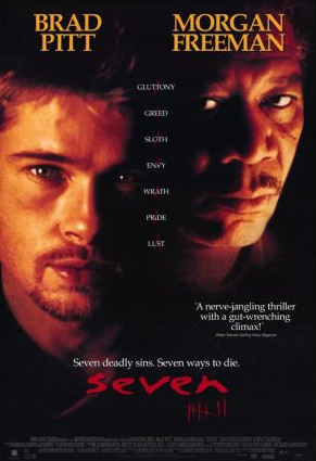
We looked into a number of title
sequences to get a feel for what we wanted ours to look like. Our main
inspiration was Se7en. Se7en is a simple title sequence, yet effective in
creating anticipation for the film.
 Our film narrative is based on a very
clever mass murderer who leaves subtle clues and riddles for the police to pick
up on. The film is more focused on the chase from the police rather than the
murderer. This is contrary to out title sequence, which focuses on the killers
lair, where he plans and looks back on previous killings. We did this in the
title sequence as it saves time in the film, as the a little background on the
killer has been shown.
Our film narrative is based on a very
clever mass murderer who leaves subtle clues and riddles for the police to pick
up on. The film is more focused on the chase from the police rather than the
murderer. This is contrary to out title sequence, which focuses on the killers
lair, where he plans and looks back on previous killings. We did this in the
title sequence as it saves time in the film, as the a little background on the
killer has been shown.
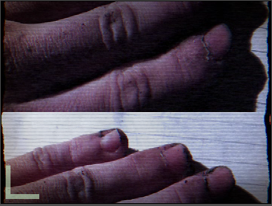
Many of our camera shots were
very close up, burring out the surroundings or only having a key light focusing
on one area that blacked out the background, which puts focus on the object in
frame. We used the occasional canted angle to just vary the shots that we used,
as most of the movement was added in editing. We didn’t have any panning or
moving shots because of how close up and detailed the still shots were. In
editing we used the Bad TV effect to create movement, rather than just having
still images.

The background sound we used was
in the genre of ‘industrial’ or ‘industrial metal’, which is a heavy and
intense sound. We used this as it build up suspense and horror in the title
sequence. The as the music moved on, it gradually got heavier and more haunting
until the light went out and the music dulled down again.
The mise-en-scene of the title
sequence was very dark, small and cramped. It was based in a shed therefore we
needed to convey the size. We used many close up shots; this meant the viewer
feels closer to the killer and what is happening as they can see every little
detail of his workbench and his hands in some shots. As there are no panning
shots the audience can only see from what’s burred out behind the main object,
this could be said to create suspense.


Our typography is a scratchy
front, which looks like someone has written the words and then back gone over
them a few times. This could be said to be the killer’s handwriting, as it
looks very erratic. Furthermore, it fits very stereotypically into the
suspense/thriller genre.

Finally, our title sequence
doesn’t necessarily challenge the conventions of traditional media in this genre, rather
fits perfectly into it. We wanted it to be clear as to what the film would be
about and we feel we have achieved that.
No comments:
Post a Comment