Forrest Gump
Forrest Gump uses a serrif font placed in the centre of the screen with traditional/classic music in the background.
It is very slow paced, steady and smooth with no editing or fast past paced camera work used.
The font fades in and out of the sequence which gives a further sense of calm to the sequence.
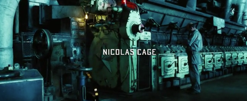
Lord Of War
Lord Of War uses laid back music against a serious issue.
It follows the production of a bullet from the conveyer belt to its transportation to it being shot.
 A small and subtle font is used, not getting in the way from the focus on the bullet.
The title sequence is a point of view shot from the end of the bullet, this follows the whole way through the title sequence.
The final frames are of the bullet being loaded into the gun, and being fired to shoot what comes across as an innocent civilian, then the sequence ends and the film begins.
A small and subtle font is used, not getting in the way from the focus on the bullet.
The title sequence is a point of view shot from the end of the bullet, this follows the whole way through the title sequence.
The final frames are of the bullet being loaded into the gun, and being fired to shoot what comes across as an innocent civilian, then the sequence ends and the film begins.
Catch Me If You Can
Catch Me If You Can has a smooth and flowing font, giving off a constant sense of movement which then gives an idea as to the plot of the film.
Two different fonts are used which slightly foreshadows the use of two different identities for the main character.
The font is incorporated into the animation of the title sequence, with a heavy Saul Bass influence too it.
 The fonts used are sans serrif and serrif, so one is more formal like a typewriter looking like THIS and the other is more informal and rounded, looking like THIS.


No comments:
Post a Comment